In the dynamic realm of e-commerce, the virtual shopfront is where the magic truly happens – the Product Detail Page (PDP). This pivotal space serves as the digital handshake of a potential customer and your product, holding the key to conversion and customer satisfaction. Crafting an effective Product Detail Page is an art that requires a delicate balance of information, aesthetics, and user experience.
In this era of ever-evolving online consumer behavior, where attention spans are fleeting and choices abundant, the significance of a well-optimized Product Detail Page cannot be overstated.
Join us as we delve into the realm of best practices, unraveling the secrets to creating PDPs that not only capture attention but guide users seamlessly from curiosity to conversion.
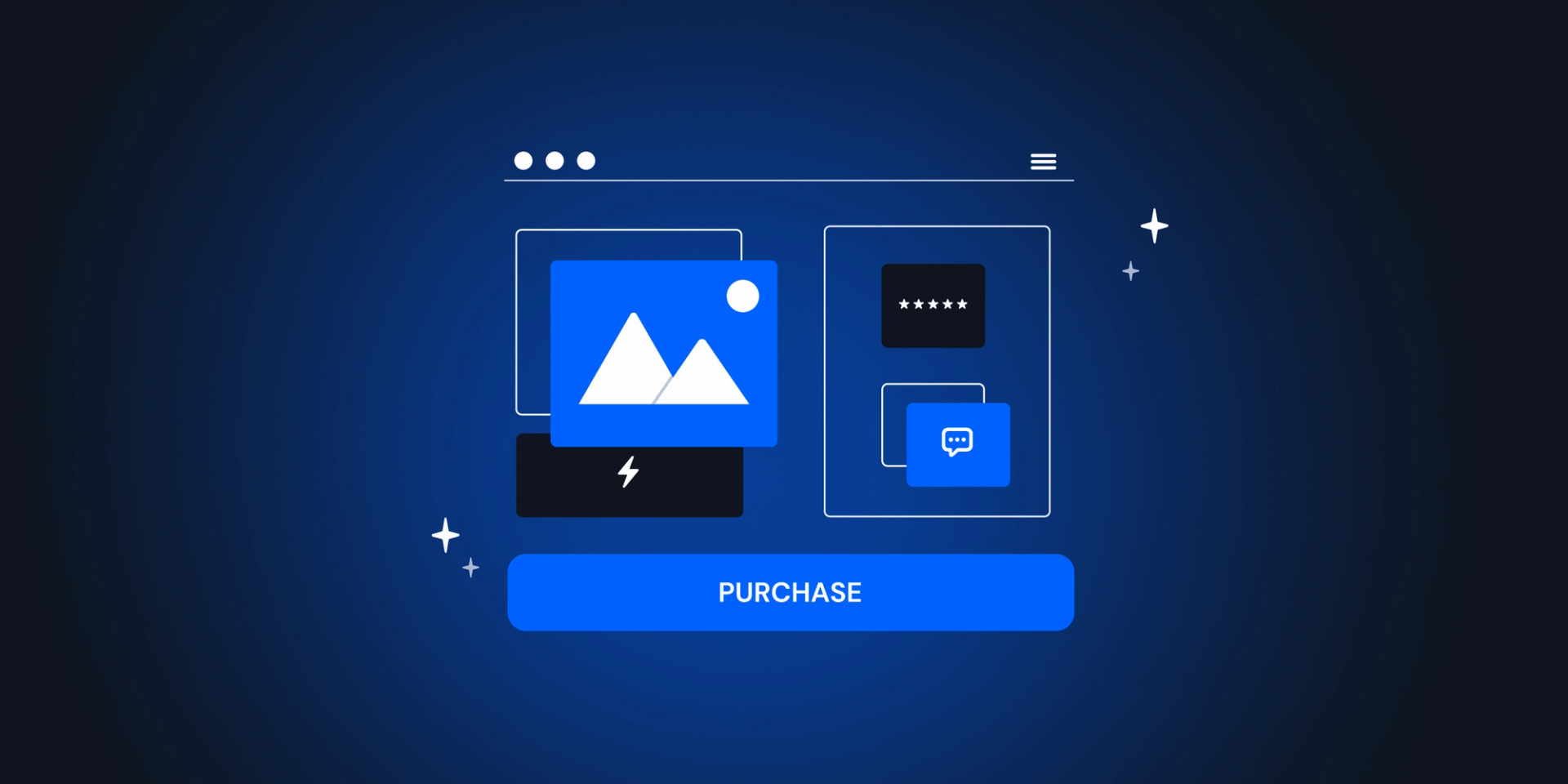
Capturing attention through visual storytelling
In the digital marketplace, the adage “a picture is worth a thousand words” takes on a new significance, and the first best practice underscores the paramount importance of product photos that make a lasting impression.
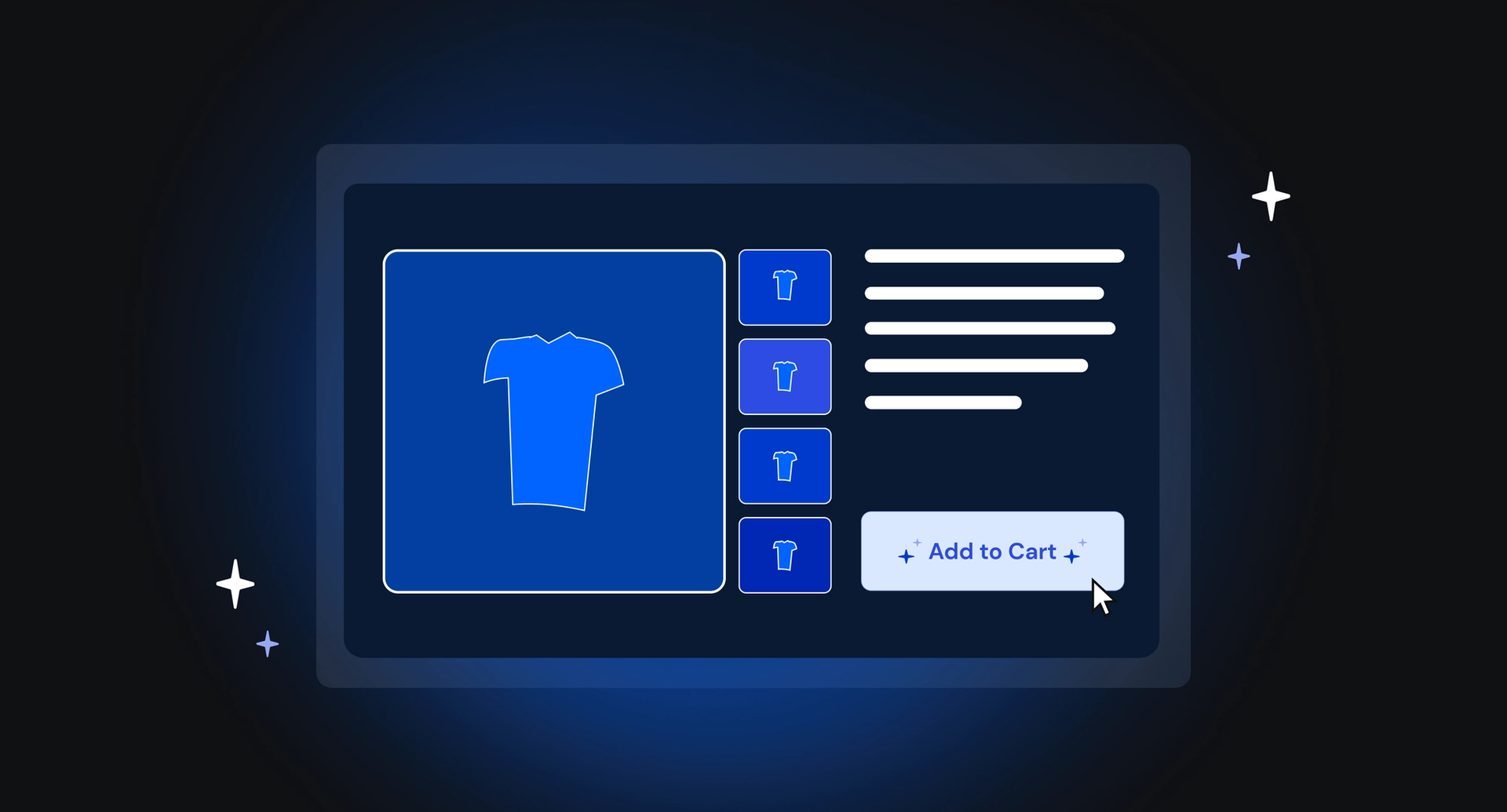
High-quality and diverse product images are not just visual embellishments; they are potent tools that can sway a user’s decision to make a purchase. A well-curated gallery of multiple photos and thumbnails ensures that users gain comprehensive insights into the product from various angles, leaving no room for ambiguity.
Importantly, including at least one image depicting the product in use provides context and aids customers in envisioning its real-world application.
Additionally, the incorporation of zoom functionality elevates the user experience, allowing potential buyers to scrutinize the product details with a level of intimacy that bridges the gap between the digital and physical shopping experience.
In this virtual age of online shopping, the careful selection and presentation of product photos emerge as the cornerstone for not just attracting attention but fostering a connection that resonates positively with the user.

Mastering the art of Call-to-Action (CTA) optimization
In the intricate dance between an online shopper and a potential purchase, the Call-to-Action (CTA) takes center stage, acting as the linchip that propels users through the e-commerce journey. It’s imperative to recognize that the CTA is not just a button; it’s the gateway to conversion, representing a critical moment where interest transforms into action.
The fist best practice underscores the significance of drawing attention to CTAs, emphasizing that the primary CTA should command attention through strategic visual hierarchy, making it unmistakably the next step for the user.
Beyond the primary CTA, offering alternative CTAs, such as Wishlist or Compare, caters to diverse user preferences and scenarios, enhancing the overall shopping experience. Moreover, acknowledging the volatile nature of product availability, providing users with the option to receive notifications for restocked items demonstrates a commitment to customer satisfaction.
In the realm of lengthy product pages, the strategic placement of sticky add-to-cart buttons ensures accessibility throughout the user’s exploration, streamlining the path to purchase.
By mastering these nuances of the CTA optimization, an e-commerce platform not only guides users seamlessly through their journey but also significantly enhances the likelihood of conversion.
Crafting compelling narratives: the power of product descriptions
Recognizing that diverse consumer preferences exist, this best practice underscores the pivotal role of creative and informative write-ups in capturing the attention of users who seek a deeper understanding of the product. Beyond the standard specifications, a well-crafted product description should spotlight unique selling points, offering users a compelling reason to choose this particular item over others.
The narrative should weave together creativity and information, providing not just details but an immersive experience that resonates with the user. Crucially, transparency is key – including information about delivery and return processes establishes trust and empowers users with the knowledge they need to make informed decisions.
In the realm of e-commerce, where words are the bridge
between a user and a purchase, the careful construction of product content emerges as a powerful tool for transforming casual browsers into confident buyers.
Nudging toward conversion
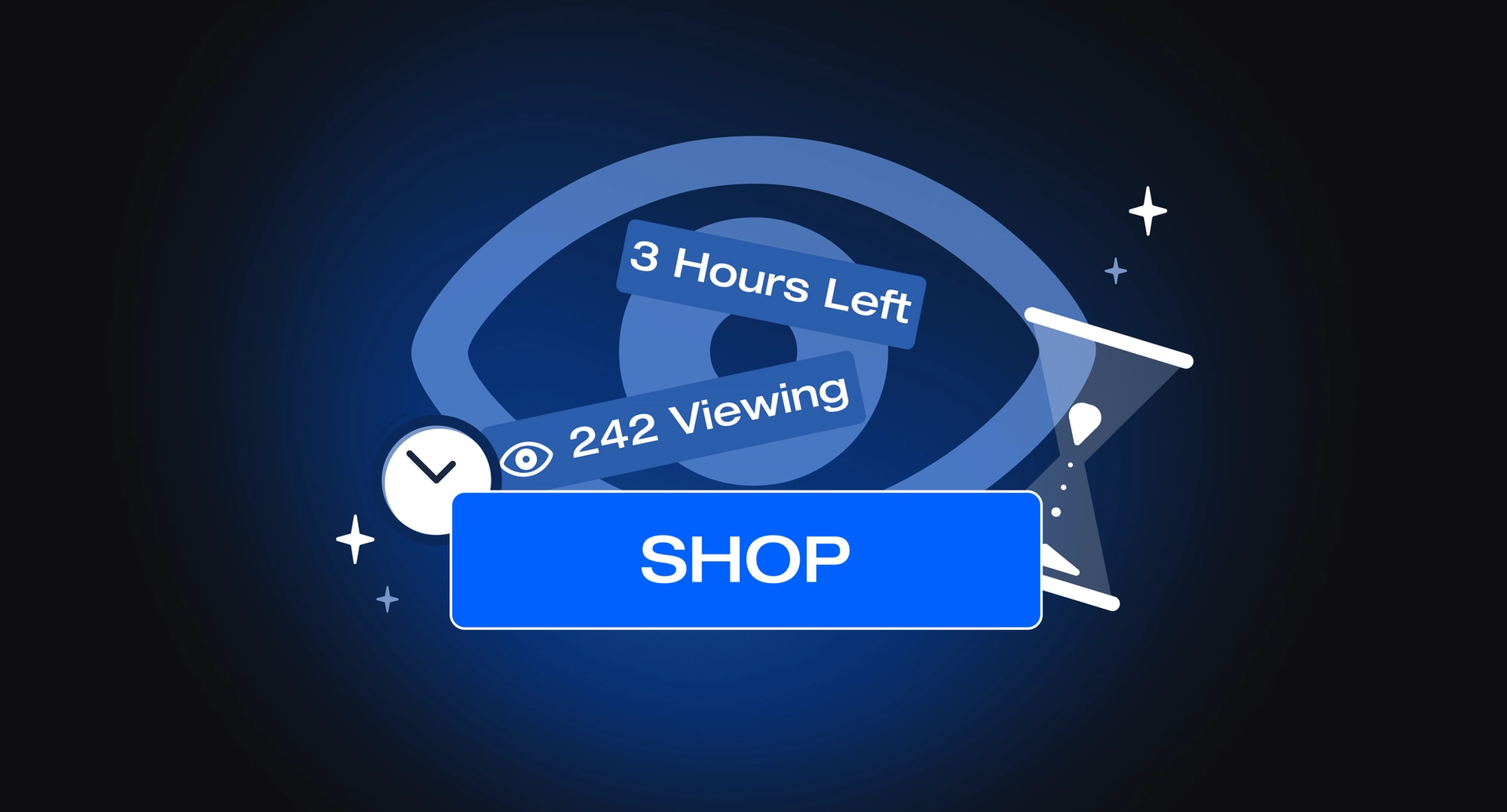
The power of persuasion often lies in the small yet impactful details strategically placed on a product detail page. This best practice unveils the subtle art of nudging users toward that coveted “Add to cart” button, employing psychological triggers that speak directly to the customer’s decision-making process.
Leveraging social proof, showcasing product reviews and ratings creates a sense of trust and credibility, providing scarcity, whether by displaying the numbers of users currently viewing or adding a timer to signal the end of a limited sale offer, taps into the innate fear of missing out, prompting quicker decisions.
The inclusion of upsells and cross-sells not only enhances the user’s shopping experience but also opens avenues for additional sales. Furthermore, making recently viewed items visible caters to the user’s evolving preferences.
By seamlessly integrating these nuanced nudges, an e-commerce platform transforms the user’s journey into a persuasive experience, subtly guiding them towards a conversion that feels not just inevitable but personally compelling.

Designing the canvas
The layout of a product detail page is akin to the canvas upon which a compelling shopping experience is painted. Diverse approaches have emerged, each strategically designed to captivate users and enhance overall user experience.
- Sticky photos and scrollable product information
This layout combines the best of both worlds, featuring sticky product photos that remain visible as users scroll, accompanied by scrollable product information. This ensures that users always have a visual reference of the product while delving into the details. - Sticky main info and CTA and scrollable photos and other info
Focused on user engagement, this layout employs sticky main information and CTA buttons that remain fixed at the top, providing easy access. Meanwhile, users can scroll through an array of photos and additional information without losing sight of crucial details. - Photos and CTA in the first fold, other info down the page
This design places product photos and primary CTA prominently in the initial view, catering to users who make quick decisions. As users scroll, they encounter more detailed information, creating a seamless flow from initial interest to informed consideration. - Photo gallery full display
Prioritizing the visual allure of the product, this layout dedicates the entire page to a captivating photo gallery. Users can immerse themselves in a full-screen display, allowing for a detailed exploration of the product’s aesthetics and features. - Out-of-the-box experience
For those daring to defy convection, this layout introduces unconventional elements that surprise and engage users. Whether through interactive elements, unique navigation, or unconventional placement of product information, this approach seeks to create a memorable and distinctive user experience.
These layout examples demonstrate the creative ways in which design can leverage not only capture attention but also guide users seamlessly through their journey, fostering a memorable and effective user experience.