In the intricate dance of online shopping, the pivotal moment when a user decides to add an item to their cart is more than just a transactional step – it’s a declaration of intent, a digital handshake between the customer and the e-commerce platform.
However, this seemingly straightforward act can quickly turn into a missed opportunity if not executed with precision.
The culprit? Often, it’s the subtle nuances of user experience (UX) that play a significant role in whether a potential sale is sealed or slips through the cracks.
Picture this scenario: A user browses an e-commerce site, finds a desirable product, and enthusiastically adds it to their cart. But the labyrinth of distractions, from notifications to competing website elements, the user forgets about their intended purchase, leaving the item stranded in the cart, a digital orphan awaiting adoption.
This phenomenon points to a critical aspect of online shopping—bad UX can be the silent saboteur that hinders the progression from cart to checkout. When customers neglect the fact that a product resides in their cart, the likelihood of completing the purchase dwindles. For e-commerce companies, this oversight can translate into a substantial loss, turning a potential customer into a missed opportunity.
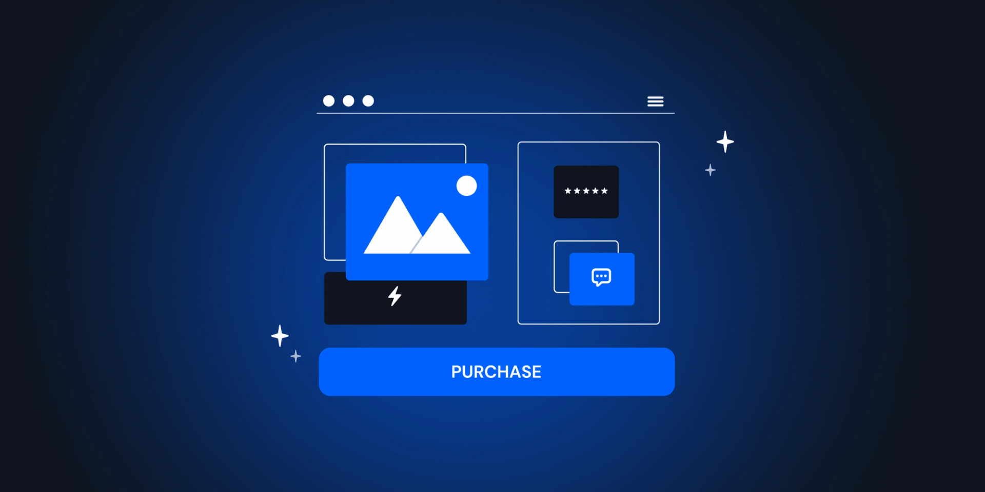
The heart of the matter lies in the prominence of the add-to-cart event. If this pivotal step is not seamlessly integrated into the user experience, the consequences can be dire. To safeguard against such pitfalls and elevate the user journey, it becomes imperative to delve into the realm of add-to-cart best practices.
Transforming the cart icon into a digital beacon
The first and foremost add-to-cart best practice is to shine a spotlight on the cart icon itself. Mere numerical indicators are no longer sufficient in the dynamic landscape of online shopping. Instead, the cart icon should undergo a visual metamorphosis, changing in color and becoming more conspicuous as soon as products are added.
This subtle yet powerful alteration serves as a visual cue, ensuring that users are immediately drawn to the cart, acknowledging their recent addition. By transforming the icon into a vibrant beacon, e-commerce platforms can break through the noise of digital distractions and etch the presence of the added item firmly into the user's consciousness.
It's not just about tallying numbers; it's about creating an unmistakable visual signal that commands attention and guides users seamlessly toward the next step in their purchasing journey.

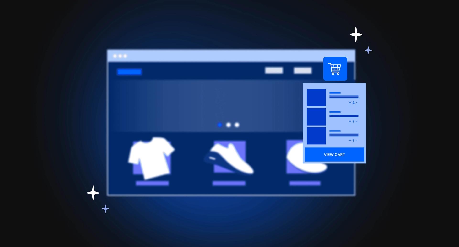
Mini cart and cart pop-up – ensuring unforgettable additions
The second cardinal rule in optimizing the add-to-cart experience involves more than just emphasizing the cart icon—it necessitates a visually compelling event that captures the user's attention immediately. Enter the mini cart or cart pop-up, a dynamic duo designed to ensure that the addition of a product doesn't go unnoticed.
The mini cart, appearing in various forms:
- As a notification box, stemming from the cart icon, presenting crucial details such as product photo, title, quantity, order subtotal, and strategic calls to action like 'Checkout' or 'View Cart.'
- The slide-out mini cart, animatedly emerging from the right side of the screen, provides an eye-catching spectacle, accompanied by a grayscale overlay that temporarily obscures the rest of the page, leaving no room for oversight.
The cart pop-up, taking center stage, demands the user's attention by materializing in the middle of the screen, forcing a pause before further navigation. While some might view it as an additional step, this deliberate interruption guarantees that users acknowledge the newly added item, reinforcing the bridge between adding a product to the cart and the pivotal checkout process.
It's not just an interlude; it's a fail-safe mechanism to ensure users are fully cognizant of their evolving shopping cart contents.
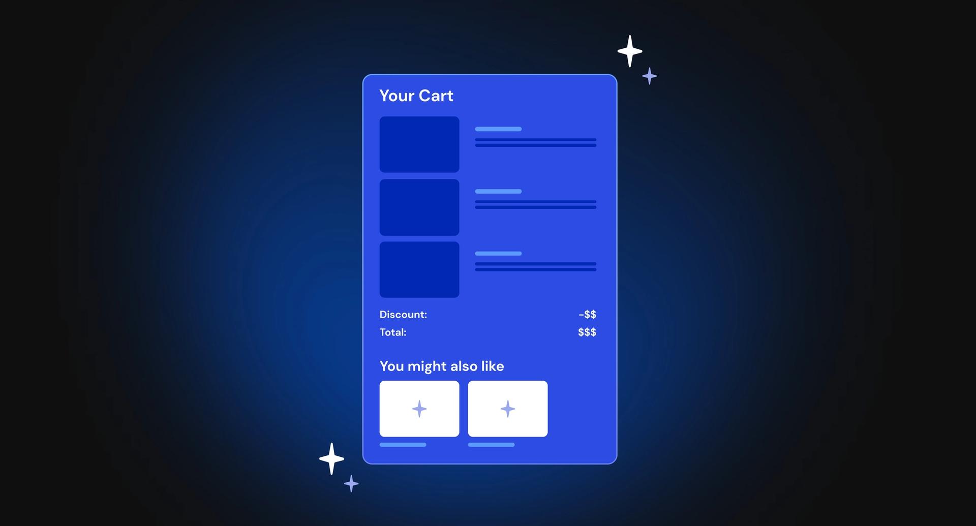
Upsell and cross-sell tactics for seamless shopping expansion
The third pivotal best practice in the art of perfecting the add-to-cart journey revolves around the strategic incorporation of upsell and cross-sell techniques. While the mini cart serves as an informative guide, displaying the recently added product and the cart subtotal, it also presents a golden opportunity to entice users into expanding their shopping horizons.
By seamlessly integrating upsell and cross-sell suggestions within the mini cart, e-commerce platforms can tactfully nudge users towards additional purchases. The key lies in finesse—ensuring that this supplementary shopping experience is effortlessly smooth.
With just a single click, users should be able to augment their cart with complementary items, elevating the overall shopping experience while maximizing the potential for increased spending.
It's not just about facilitating a transaction; it's about transforming each interaction into an opportunity for users to discover more, enhancing both their satisfaction and the overall revenue potential for the e-commerce venture.

Communicating added value for confident checkouts
The fourth indispensable best practice in orchestrating a seamless add-to-cart experience is to skillfully communicate the array of benefits awaiting users upon completing their purchase. Beyond the transactional aspect, users are more likely to proceed to checkout when they are well-informed about the added value accompanying their chosen products.
These benefits serve as powerful motivators:
- The promise of complimentary samples or gifts upon meeting specific conditions;
- The reassurance of stellar reviews and extended guarantees
In the delicate dance of online shopping, transparency becomes a key ally—users should be unequivocally informed of the advantages awaiting them, serving not only as incentives but also as a source of reassurance. Emphasizing a lenient return policy further assuages any lingering doubts, providing users with the comfort they need to confidently move forward with their purchase.
It's not just about acquiring products; it's about curating an experience that goes beyond the tangible, ensuring users feel not only satisfied but genuinely delighted with their decision to progress along the user journey.
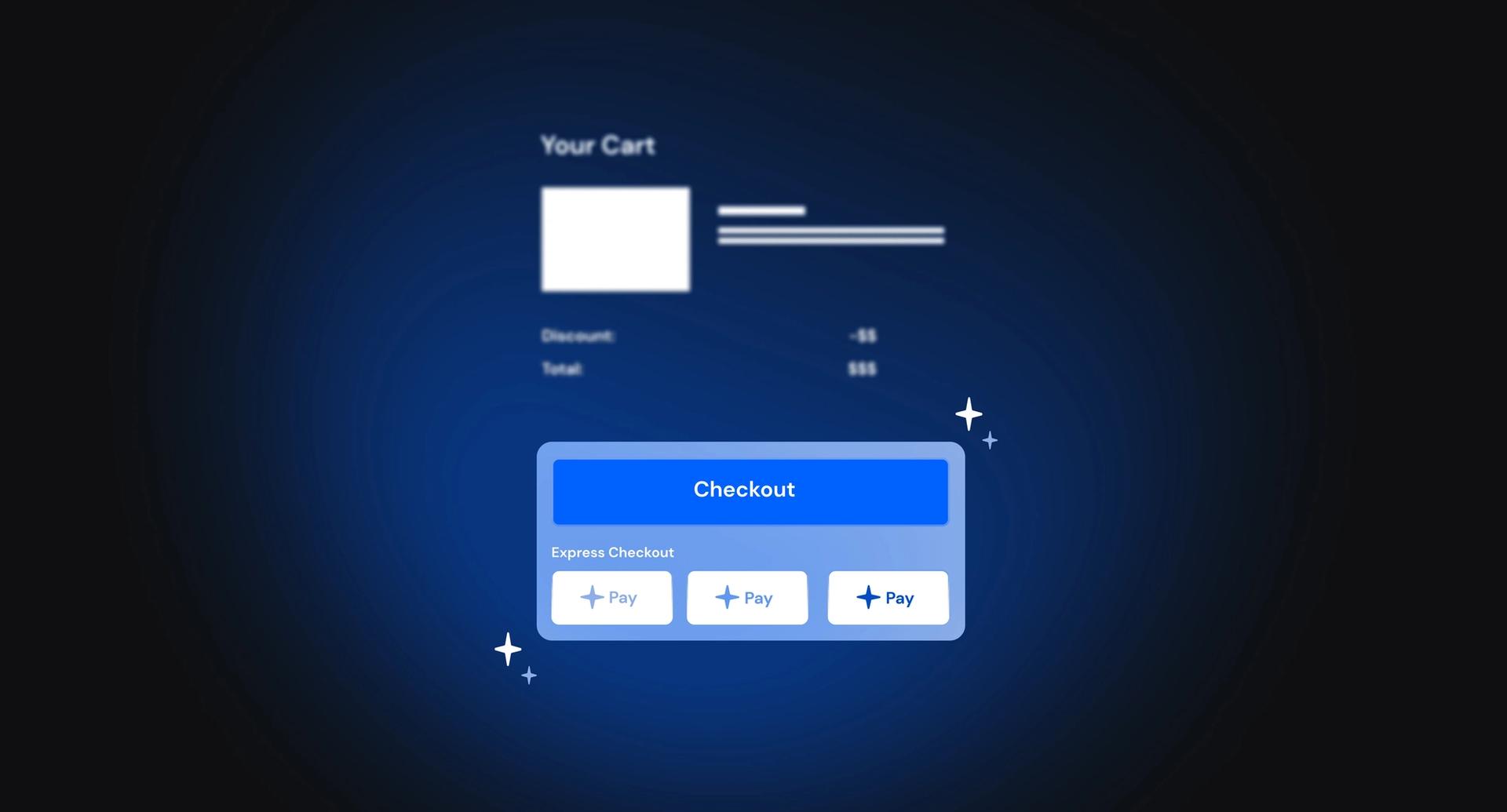
The power of express checkout integration
As we conclude our exploration of add-to-cart best practices, the fifth and final gem in this series revolves around the seamless integration of express checkout options.
In the fast-paced realm of online shopping, where convenience reigns supreme, providing users with a direct route to checkout is a game-changer.
The mini cart or cart pop-up serves as the ideal canvas to spotlight these express options, offering users the efficiency of completing their purchase right from their current page, bypassing the traditional checkout process. This not only expedites the transaction but elevates the overall shopping experience, aligning seamlessly with the modern user's desire for streamlined interactions.
By incorporating express checkout options, e-commerce platforms not only cater to the need for speed but also leave users with a lasting impression of convenience, solidifying the journey from add-to-cart to checkout as a frictionless and user-centric process.